
Building a custom SwiftUI component library with DeveloperToolsSupport
Make Xcode work for you

SwiftUI makes building UIs easier in some respects, but Xcode’s Library seems to be perpetually jammed with items that you will never use. Meanwhile, your most popular custom views are stacked away in source files, waiting for you to remember their name so you can type them out from scratch.
There is a solution — and Apple gave it to you: DeveloperToolsSupport
With it, you can cause your components to appear in Xcode’s Library panel, ready to drag-and-drop wherever you like — just like any native control.
What is this?
DeveloperToolsSupport is a framework built to give you the ability to extend Xcode’s Library.
Its primary feature is the LibraryContentProvider protocol.
If you implement it, you can make your SwiftUI views and modifiers show up in the Library panel (⌘ + ⇧ + L) with your own titles and categories.
Think of it as an official back door to make Xcode’s Library your own, custom UI toolbox.
Why use it?
Save time – Drag-and-drop a custom view like it was native, rather than typing it out repeatedly!
Keep your team consistent – All of your developers are working from the same source of components, avoiding style drift.
Boost reusability – Package your UI components for easy maintenance and updates, and to ease re-use.
A working example
import SwiftUI
import DeveloperToolsSupport
We start by importing SwiftUI for the UI building blocks, and DeveloperToolsSupport so we can access LibraryContentProvider and LibraryItem.
struct MyLibraryContent: LibraryContentProvider {
    @LibraryContentBuilder
    var views: [LibraryItem] {
        LibraryItem(
            MyCustomView(),
            title: "Custom Profile Card",
            category: .control
        )
    }

    @LibraryContentBuilder
    func modifiers(base: AnyView) -> [LibraryItem] {
        []
    }
}
MyLibraryContent conforms to LibraryContentProvider, which is the hook Xcode uses to find your custom components.
The views property is decorated with @LibraryContentBuilder so you can list multiple LibraryItem objects without array brackets.
Here, we register one LibraryItem, pointing to MyCustomView(). We also give it a title for display and a .control category so it shows up in the right place in Xcode’s Library.
The modifiers(base:) method would let you register custom SwiftUI modifiers; we return an empty array because we’re only adding a view.
struct MyCustomView: View {
    var body: some View {
        VStack(alignment: .leading, spacing: 8) {
            Text("John Appleseed").font(.headline)
            Text("iOS Developer")
                .font(.subheadline)
                .foregroundStyle(.secondary)
            Divider()
            Text("Passionate about building delightful user experiences.")
                .font(.footnote)
                .foregroundStyle(.secondary)
        }
        .padding()
        .background(Color(.systemGray6))
        .cornerRadius(12)
    }
}
MyCustomView is the actual SwiftUI component we’re adding to the Library. It’s a simple profile card:
A VStack aligns everything vertically with 8pt spacing.
A headline for the name, a subheadline for the role, and a divider for structure.
A short description in a smaller, secondary-colored font.
Padding, a light background, and rounded corners to give it a “card” look.
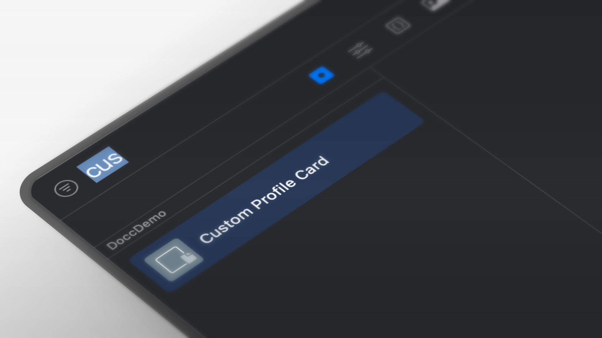
After you build it, you can open the Library panel in Xcode and you will see Custom Profile Card there.
What about the empty “Details” panel?
While you can’t fill it — Apple has not exposed any way for you to add a description to your custom Library items — that’s expected behavior. Rather than worrying about what you can’t do, use ways to support how people consume your component that you can do:
Descriptive titles – Include the type and its variation (e.g., “Profile Card • Compact” or “Profile Card • Dark”).
Categories – Use .layout, .control, or .effect help them find the item they are looking for.
Quick Help – Include usage notes in the type’s documentation comment so teammates can see them via ⌥-click or Quick Help (⌘ + ⇧ + ?).
Team documentation – Keep a slim internal documentation or DocC page to capture images, code examples, guidance, etc.
Going further
Share via Swift Package – Share your LibraryContentProvider code and the custom views package so everyone gets the latest.
Use naming conventions –Prefix similar components to keep them based on relevance (e.g., “Profile Card • …”, “Profile Header • …”).
Add code variants – If your component has different configurations, then provide individual entries in the Library for each to save them time.
The takeaway
DeveloperToolsSupport is small, but it is a real multiplier to your productivity for SwiftUI work.
It doesn’t just save you a few keystrokes — it turns your private components to drag-and-drop building blocks.
The next time you create a great SwiftUI view, do not let it be just another file. Put it in the Library where it belongs.